What is CSS | Cascading Style Sheets MDN Reference
Cascading Style Sheets is a style language that is used to modify the look of a markup language. This language only modifies the look of an existing file. All browsers have their own default CSS which we can change through our custom CSS. In CSS, everything on a webpage is made of boxes that we can change, arrange, and style.
Before CSS, using HTML elements and attributes can be difficult as lots of code needs to be written to write something simple and making coding errors or spelling mistakes can be easy.
Useful Links
Inline CSS -> Using the style attribute
We use inline CSS to write css into an element using the style attribute. This can be done to do things such as change a color or a font size.
We use a style tag to change the background and the font.
How to set up Inline CSS
- Choose an element to inject CSS into. EX-> p
- Add a style attribute. EX -> < p style="">
- Add some properties. EX -> < p style="font-family:roboto;">
- There is a colon(:) between the property and value. EX -> property:value
- End the statement with a semicolon(;)
- Ensure that the statement is in double quotes("")
- Add in more properties if you want. EX -> p style="background:pink; font-family:roboto;
What if we wanted to change every element on the page? We would have to change all of the elements on the page to contain the same style attribute... There is an easier way (internal css)!
Internal CSS -> The Style element inside the head element
We use internal CSS when we want to change the way that every element (of the same type) looks on a page. This is done so that we don't need to change every single element individually when we want to update a page's appearance.
How to set up Internal CSS
- Find the head element in your HTML file.
- Insert the style element (< style> < /style>) into the head element.
- Add in elements, classes, or ids to change (element, .classes, #ids).
- Each css rule should look something like so. EX -> body{background:pink; font-family:roboto;}
External CSS -> Link in the CSS File
We use external CSS when you want a style to be applied across the entirety of the website without wanting to copy internal CSS element to every affected page.
In short, the external css will modify the appearance of any page that links to it.
How to set up External CSS
- Create a folder named css. This goes inside of your website's project folder.
- Inside of the css folder, create a file called styles.css
- Link the styles.css file to your HTML document. Using the < link> element inside of the head element of your HTML file as follows -> (link rel="stylesheets" type="text/css" href="css/styles.css")
- By the way, if there is a / in /css/styles.css, the / in the front of the directory means that the file is located in the root, instead of the same directory level. If you remove the /, then the file is in the same directory as the current file that is calling it.
If we specify a CSS rule in two places, which one is applied?
When writing CSS, more specific code overwrites the more general code. If you write a global rule, and then inline CSS, priority is given to inline CSS. With this in mind, you can apply specific changes to the code by writing inline CSS.
Types of CSS Ranking
Least Specific -> styles.css (External CSS)
More Specific -> style element in the head element (Internal CSS)
Most Specific -> element style="" (Inline CSS)
TIP! It is recommended that you apply all styles in your external CSS (styles.css) file.
General CSS rankings
Least Specific
Position -> If there are two of the same rules, but their values are different, the value that is lower down on the list is applied
Specificity -> Refers to how specific the rules are. Elements -> Classes -> Attributes -> IDs
Type -> styles.css -> internal css -> inline css
Keywork !important -> Adding the !important keyword to a rule after the value will ensure that this is applied.
Most Specific
When code has errors such as logic issues or spelling mistakes, debugging is important!
To debug, you should first try to identify a problem. For example, if you have inserted a CSS file but do not see any CSS, check the link for the css file. If there is an issue where parts of the css page is working but other elements are not, you can try checking for things such as a spelling error or for inline css.
You can use the browser's built in developer tools to try to find issues. Chrome developer tools can be used to find missing files when running an HTML page. Developer tools can also tell us what types of styles are currently running on a page as well.
TIP! To ensure that CSS is working on the current page, make a dramatic change to part of the site's content, such as changing the background-color property, to check.
Syntax is the grammer of a programming language, and CSS syntax is no different.
selector {property:value;}
- selector -> Who are we changing (p, h1, h2...ect.).
- property -> What are we changing (background-color, font-family, border...ect.). Multiple properties can be applied to the selector.
- value -> How are we changing the property (black, blue, roboto, dotted...). This depends on the property.
The best practice for css is to put each changed property in alphabetical order. EX -> p{background-color:orange; color:green; font-family:roboto;}
All CSS Statements must end with a semicolon(;) at the end of the statement.
Selectors can be the following
- elements -> h1, p, div
- Applies a change to every single instance of the element. EX -> Applying a red color(backgroundcolor:red;) to an img will apply the red color to every img on the page.
- classes -> .class
- Used for specific styling and targets specific elements.
- Can be used on multiple elements on a page.
- Can be used when you want to apply the same style to a group of elements.
- Elements are allowed to have more than one class. EX-> < element style="class1 class2">
- ids -> #idname
- Most specific
- Only one instance per ID is allowed on a page. (Classes can be used multiple times)
- One ID can only be used for one element (Ie. < p id="id1"> means that it cannot use id2, or id3)
- ID is used sparingly. It is suggested not to use this, but there are some cases where it might be useful.
If you mispell the selector or the properties, the CSS might not work correctly.
Each element can only have ONE(1) ID. They can have multiple (MORE THAN ONE) classes, though!
The hierarchy for specificity is (least specific) element -> class -> (most specific) ID
Targetting Selectors
There are different ways that selectors can be targeted.
- Group Rule -> Applies the same style of all of the selectors.
selector{rule}
- Target Element Attributes
p[draggable]{color} changes all p elements that have the draggable attribute to the color. You can also select the value of the attribute. If < p draggable="true"> and < p draggable="false"> then if your css contains p[draggable="true"]{color}, only the p draggable that is true will change color.
- Descendent-> Change the css of a selector2 that is inside selector1. The style is applied to the selector2 as long as the selectors match.
selector1 selector2{rule}
- Parent Child -> If there is an element, this targets only direct children of the element.
parentselector > childselector {rule}
- Chaining Selectors -> This will apply the style to selectors when all of the selectors in this chain are in the element. If there is an element in the chain, it goes first.
selectorselector{rules} | element.class#id{rule}| element#id{rule}
- Ancestor
selector selectorselector{rule}
- Changing Multiple selectors-> Changes both elements that are listed, using a comma
h1, h2{property:value;}
Psuedoclasses
Classes can have different states. On occasion, if one would want to hover over the elements on a page, they can change the values.
For example, if a user were to hover over an image, the background color of the image may change.
img:hover{property:value}
Colors
- background-> changes background color. You can use a color name, or a hexcode to change the color.
- color-> changes font color. You can use hex codes, color numbers or named colors.
Fonts
- font-size -> changes font size. can be done in px(1/96) pt(1/72) em(100% of parent) rem(100% of root). Developers should set the font to be rem to avoid confusion with parents.
- Font Family-> changes the font. Include a desired font, and a fallback font. You can choose a font using sites such as Google Fonts
Borders
- border-style-> Changes the border's style. This can be a border around an image or a textbox.
- height-> changes the height of our css box.
- width-> changes the css box's width. can be numberical or a percentage.
DIVS (Content Division Element (Used in conjunction with CSS)) | More Here
DIVS are a special HTML element that doesn't do anything without CSS. Using a DIV element can allow for an HTML document to be sectioned out and stylized. In general, each element is in their own box, but placing elements inside a DIV can put them into organized boxes that can be moved, stylized, and arranged.
EX-> You want to have a certain part of a webpage to have a background and border, and the font inside to be impact. This can be done like so:
- Inside the HTML document, create a div and assign it a class -> < div class="pog">
- Inside the CSS document, specify what you want to change ->
.pog{background-color:whatevercolor;} .pog p{font-family:fontofchoice;}
A DIV will take on the height and width of the contents.
You can also specify...
- padding-> Expands the size of a div. Adds space between the content and the border
- border -> Draws a line around the DIV. Expands the div size. We can specify width, height, border, and so on, and expands outside of the intenal area. A border of 50 px will make a 300 px object 400 px total.
- margin -> Expands the space surrounding a div. This can be easily shown when positioning other divs around this one.
CSS Box Model -> Easily Visualize CSS adjustments | READ MORE
The CSS Box Model can be found in a browser's inspector.
Using a CSS Box Model in the inspector will allow for someone to view and make visible adjustments and changes to the website that will not be committed to the code. Changes made here needs to be copied into the CSS to make these changes permanent.
The default browser CSS can also be viewed using the CSS Box Model
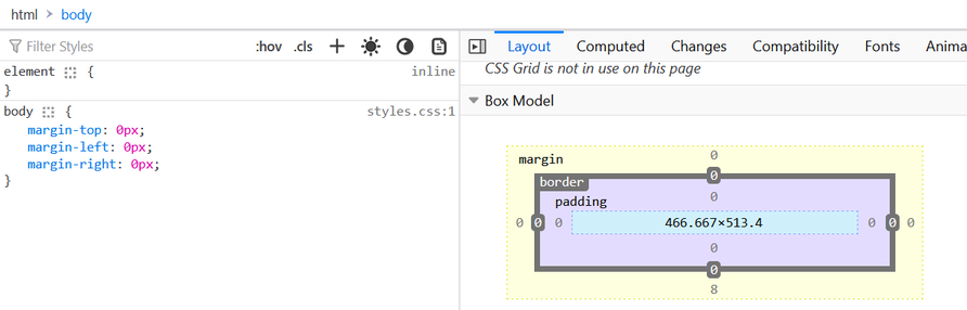
You can also add in custom rules here for the elements and see how it will affect the page in itself.
Span
Can be used to select just one part of a text to format or modify it with CSS.
Used in conjunction with CSS
Is an Inline Display Element, only taking up as much height and width as it needs to.
CSS Display & Position
Display Property | Read More
This specifies the display of the element.
- Block -> By default some elements are blocks. Take up the whole width of the screen. No other elements will sit next to it.
- Inline -> These elements take up only as much height and width as they need to. However, you cannot change the width of these elements.
- Inline-Block-> Contains the benefits as inline, allowing other elements to sit next to it, while allowing the width to be freely changed. May add some space depending on the browser.
- None -> This removes the element from the website. can be used in the case that you have a quiz and want to hide the answers.
- Visibility:hidden -> Makes the element disappear but the element does keep it's position, and other elements still flow as if the element was visible.
Display does not work unless the position property is set.
Positioning in 9 Minutes - Supplementary Material
Even without css, there are predefined rules. Content is everything. Order of elements is based on how its written in the code. Children are inside of their parents. Child objects are on top of their parents on dispaly.
We can set css property position to position things the way that we would like to.
- static -> All html are static by default. They follow the rules and go with the html flow.
- relative -> Position the element we want relative to how it would have been positioned. If we change an element to relative, we can move an element based on whre it would have been. we change it using coordinates. We need to remember that when we move an element that has a relative position, it doesn't affect the position of any of the other elements around it. It leaves a ghost space where it used to be, basically. When we change the coordinate properties, what we do is that we are bastically giving the element a margin based on the coordinate.by irself, the position doesnt do anything. it requires the coordinates to change its position. relative to the element to where the element would have been displayed in natural html flow.
- fixed -> If a position is fixed, then the item will stay in it's current position. This item will stay fixed in it's position relative to the position. it might be useful for a header bar or a div bar for a website.
- absolute -> Let's say that there is an image inside of a div. When using absolute and shifting the image to the left, it shifts relative to the parent object (div). The margin is relative to it's parent. The parent is most times the whole webspage. we add a margin to an item bassed on the edge of a parent object. This affects the flow of the html. We take the element out of the flow of the document. The object can be moved anywhere on the screen relative to it's parent. It is easier to move things around using absolute positioning relative to the body, or to the same thing. It is easier for people to think about layout this way. parent doesnt need to be the body. If there was a div inside of a div, the first div would be a parent. Anychanges made to the second div in terms of positioning would be relative to the first div.
- sticky->
Centering elements using CSS.
- text-align -> Must be set in the parent container. Works with elements that are inline-blocks or the entire width of the box.
- margin:auto -> Centers an object vertically or horizontally
- If you have a parent element that centers everything, you might have objects inside that are inline blocks with set widths. These inline blocks will have to be centered by adjusting the margin.
CSS Floating
we can make an image float to the left and have text to be the right. If we float on the image element, then the text can be on the left. If you want space between image and the text, you can add a margin right ot the image.
Can be used a lot, but should only be used for cases of wrapping the text around an element.
clear can be used to to prevent something from wrapping on the left. This can be thought of the opposite of float.
This should only be used for wrapping text around another element, and is not a free for all positioning element.
Changing Fonts
Font-family: can change all the fonts on the wbsite. monospace for coding because it makes everything easy to read.
Cursive and fantasy and low readablity and not oftem used.
serif is by default. Times and arial are defaults.
We can add specific fonts to our css. font-family: verdana, sans-serif. The font defaults to verdana, but if the system doesnt have it, sans serif is done.
Web-safe fonts. There are font familties that most sites can render safetly. no font is 100% websafe.
If we want to use a font but are unsure if everyone has it, we can use fallbacks.
Font Stack for Fallbacks
What if we want everyone to see the exact same thing that we intended? If you want everyone to use the same font, we can use font embedding.
Google Fonts can be used to embed a font onto a website. These are fonts that can be commercial. search and add fonts to your desire. Then after finding them, you can add them to your head element, as a link. Then, ensure that the font name is inside of your css code file.
when using css for margins, use pixels.
when doing css margins, it goes top, right, bottom, left. So, you can use
Change font color. Inside the element tag,,,
color:#hexcode
font weight is font-weight. This can be specified using keyword or by numbers
line height is line-height. can be specified with number. The perfered way is the single value without a unit.
Responsive Websites
This is how the layout should change depending on the size of a screen. This might be a different view for a mobile site VS a desktop site VS a tablet site.
Done through a few different methods
- Media Queries -> Used instead of a selector in CSS.
- CSS Grid -> We create a parentdiv that contains divs within it. In the parent div, we give it a display:grid property. Then we also set grid-template-columns and rows, and gaps.
- Flexbox -> This can create 1D layouts easily.
- External Frameworks-> Things such as a bootstrap framework.
Used to display a different version of chosen elements when the screen is a certain width.
@media (breakpoint){rules}
Example of use
h1{font-size:30px;}
@media (max-width:600px){
/*Used for sites that are <600px wide*/
h1{font-size:20px;}
}
For example, if we define a div that has a height and a width, then later define @media(breakpoint){div{new height and width}}, the div will change when the breakpoint conditions are met
1 fr is a fraction of the screen.
- grid-template-columns
- grid-template-rows
- gaps
can create a complex layout very quickly, and can specify specific classes to certain parts of the layout.
Good at displaying information on a horizontal or a vertical line.
Uses display:flex, and divides up the width depending on the flex: value. This divides height up by ratios.
Bootstrap
Divides the space up to 12 columns.
CSS Comments
Comments are written in CSS using a /**/ format.
/*comment goes here.*/
Comments can be used to organize code, and explain what certain parts of the CSS should do.